Printing.com Sample Range Redesign
Print Design | 2020
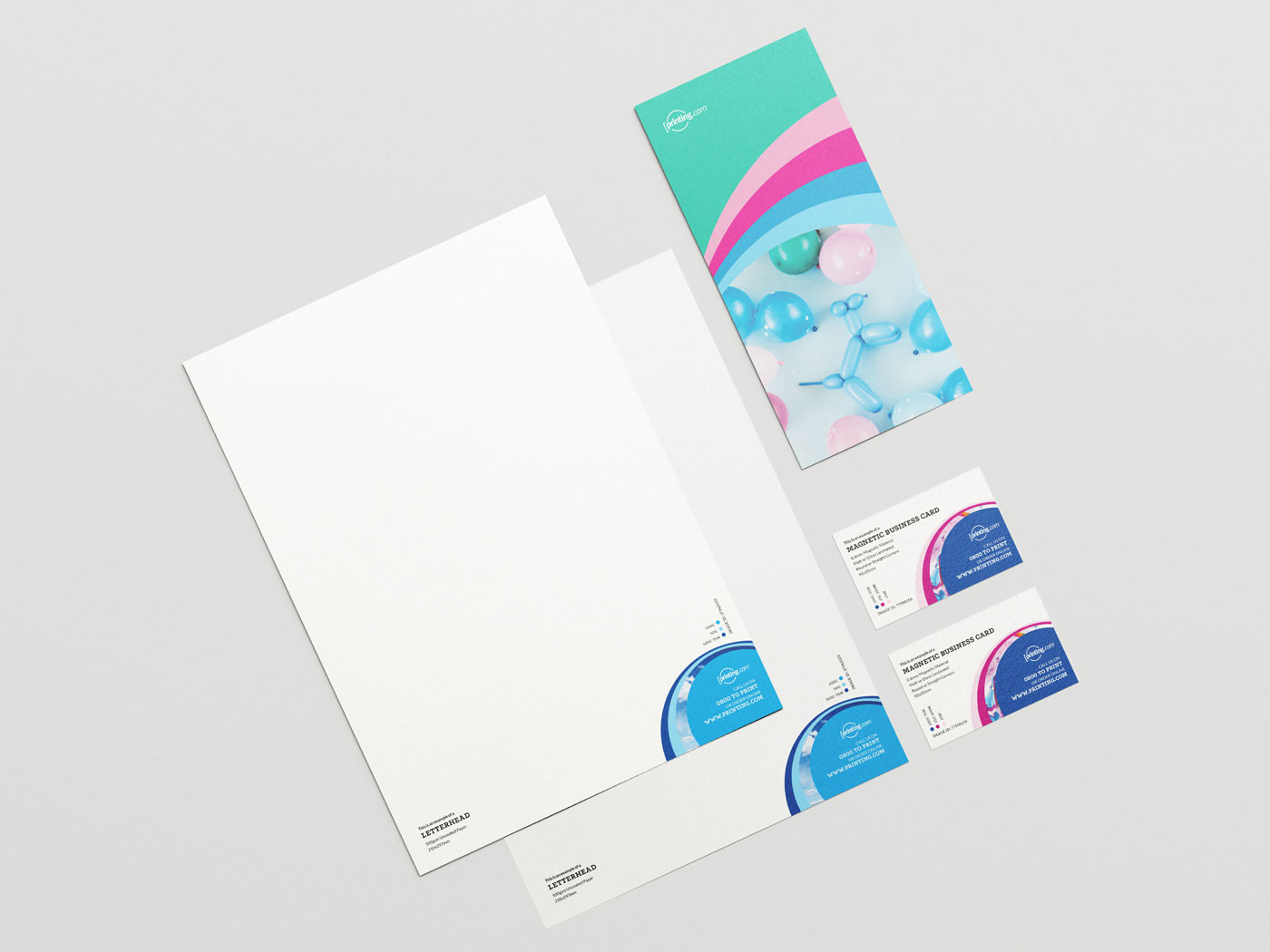
The Printing.com sample range showcases the different types of print finishing, sizes, and products that Printing.com New Zealand offers.
We had an excellent opportunity to revamp the current sample range with a price increase nearing. We discussed what we wanted to do with the new sample range as a team and knew that we did not want to include pricing on the updated sample range as in future years, each price increase would lead to a waste of samples and time updating the range.
The goal was to create a sample range that is bright, eye-catching and paid homage to the Printing.com logo.
We knew we wanted to include some of our lesser-known services, such as our image library. The image library is a service that customers can browse from their accounts and purchase images to use in their marketing.
We also wanted to include and represent CMYK colour values, as colour plays the most crucial role in print, and it can vary depending on the print process.
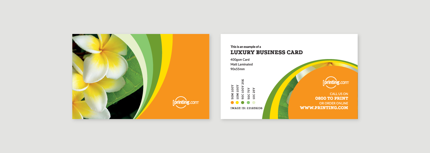
On the front of the card (left), I used this space to be eye-catching and colourful when facing up from a desk or sitting in a business cardholder. I used images and bold blocks of colour to showcase the services we wanted to highlight and show how they printed.
The reverse of the card (right) holds all our most valuable information that the customer needs to know about the sample. I included information about the sample’s specifications in an easy to understand format.
In the bottom left corner, you’ll also notice information regarding the specifics of the CMYK colour breakdowns and the image number used to identify and find images in the image library quickly.
The CMYK values all come from our Colour Process charts used with customers to reference colours they might be after and show how they look on different stocks and finishings.
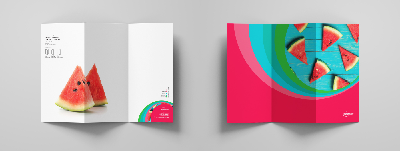
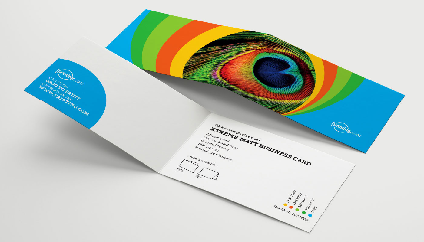
As we wanted to showcase a range of our most popular sizes & finishings, I broke down our samples into sections. These being Business Cards, Flat, Folded & Creased, and then Stationery. With the stationery range, we designed these so these could be used by Network Partners while also showcasing how customers could also use them.
I created a collection of samples, and some are shown below. With different shapes, finishings, and sides printed I had to adapt the design style to suit.
In each separate sample, I made sure to keep the core elements of the image, the colour bands, specification information and colour values. We balanced areas with lots of white space with creative photos that reflected the hero image.
